There is hope for the hopeless!
Maybe you have a stack of dead soldiers in your army of past paintings. "Never throw away an old painting". I've heard it often, maybe you have too. It's good advice. Today I share the technique used to breathe new life into a once-dead painting.
Take YOUR painting from the Boneyard to Best in Show =)
Whether you would call it reincarnation, evolution, or resurrection, this Easter weekend I celebrated more than one miracle. Two of my paintings won awards in the Spring Seacoast Artist Guild Show on Saturday night. It felt like a miracle, because I knew the secret history of the winning painting. I knew that it had once been pronounced DOA (Dead on Arrival), and yet here it was sporting a big ribbon and "SOLD" on the tag. Talk about transformation! I thought it would make a lesson worth teaching and a story worth telling to both my students and you... |
| "Out of the Shadows"- mixed media watercolor on Paper "Best In Show 2015" Spring Seacoast Artist Guild Show Collection of Glen and Martha Sledge |
If you're like me, you have stacks of paintings. There's the stack of paintings which are complete. If I love the painting, it gets put in the pile headed for the frame shop. Since this is an expensive pile, it tends to be my smallest pile.
If I'm not sure whether a painting is complete or not, it goes in the "To Do" stack of paintings (often my biggest stack).
 If a painting is lost and I'm pretty sure it's beyond redemption, then it goes into the pile I don't show anyone. It's squirreled away in a box in the closet.
 I call it "the Boneyard".
How to Save a Failed Painting- Turn Your Failed Painting into a Prize Winner!
Step 1:Go to your boneyard or your "I don't know what to do with it" pile and find a painting that you'd like to reinvent. I would suggest something with good color harmony.
- You could also look for the following: exciting line quality, nice value patterns, interesting shapes, patterns you enjoy, or maybe a cool texture. Any of these might be used as the foundation for a new painting.

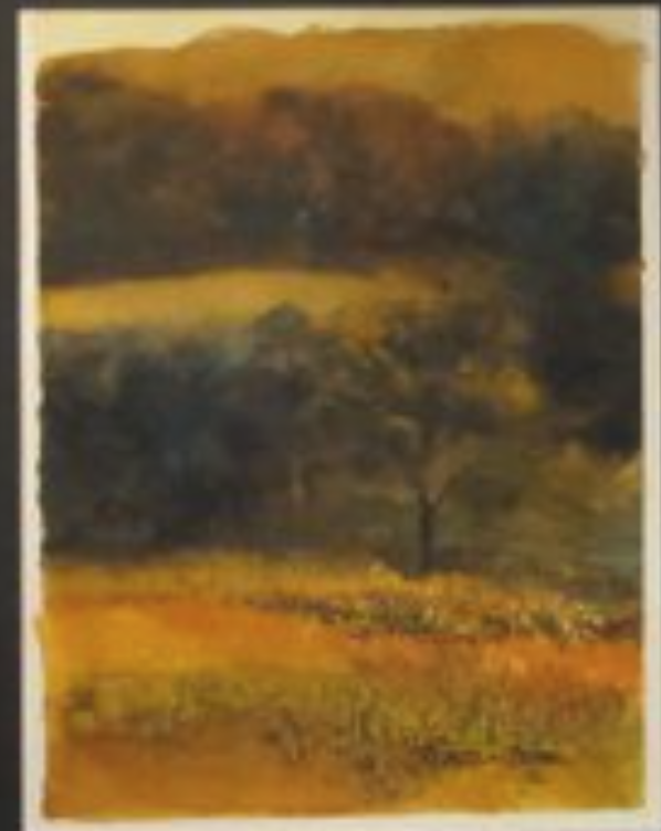
Here is a painting very similar to the failed painting used as the foundation for "Out of the Shadows" shown above.
As you can see, it was a dominantly warm painting, with some horizontal movement. It failed to pass muster, so there it sat. DOA. The mood created by the harmonious color was promising, so it became the basis of this exercise.
Step 2: Ask Yourself, "What If...?"
I liked the color harmony and asked "What If...?" When I ask this question, magic can happen.
This time the question was, "What if I make a collage paper that organizes my painting into a good design?" Good design is fundamental to successful paintings, and so I chose a design form I tend to like: Strong Verticals. Here are some other examples of images with strong verticals:
 |
| Strong Verticals add a sense of organization to even a minimalist arrangement. |
 |
| What Lies Beyond- Rebecca Zdybel Acrylic on Canvas |
 |
| Painting with vertical composition by Bob Burridge- Love his work! |
Since my painting was a horizontal, I turned it on it's side to create a vertical orientation. (yes, that's allowed!) If you'd like to take your old painting and do something similar, decide on the best orientation for your piece.
Step 3:
Take some collage paper pieces, and lay them down to create a vertical organization. Or collage over your painting with collage pieces that contain vertical elements.
Adhere the collage to your failed painting in various vertical shapes using either thinned Yes! paste or acrylic matte medium. Let the underpainting show through in various ways. Or, in as in my case, you could adhere translucent collage paper over the entire painting. If you wish, you can then reveal the underpainting in various ways.
4. Always Strive for "Harmony, with Variety"
I use Harmony an overriding principle. Be ready to sacrifice everything for the sake of Harmony. If you have harmony and unity, I guarantee your painting will hold together. Set a goal of repetition with exaggeration and variety...in this case, we are going to exaggerate color temperature and organize shapes to create vertical movement. This is how exaggeration helps a painting. By emphasizing a design plan, we will likely create a sense of dominance, and that dominance will bring harmony to the painting.
5. After adhering your collage- Paint on top of the collage, or paint negatively around the collage to accentuate or embellish the painting. Create movement and trails for the eye to follow. Do this using color, value, shapes or lines. Our eyes look for stepping stones to follow and as artists we can make this happen for our viewers. Remember, as the artist, YOU are in charge of where the eye will go.
Remember this design fundamental: Repetition with Variety
Be careful not to do the same thing over and over in the same way. Every time to you repeat yourself, do it a bit differently. Think of it this way. If you listened to a note on the piano and the same note was played in the same octave at the same volume with the same rhythm, it wouldn't take too many of those notes before they made you crazy. Vary your notes.Not a musician? As an artist your notes are your shapes, colors, lines...whatever you create. Vary their size, their direction, their color, their edge quality, their texture, their pattern, their value. This variation, will keep your painting from being boring. Be anything but dull! Push your paintings, exaggerate, risk going too far. Especially in watercolor, I think the tendency is to be safe, and sometimes that results in dull work.
6. Create a Focal Area or center of interest: To establish an area of interest or a focal area and entertain the viewer with a little "surprise". For example: in a predominantly warm painting with light colors, it might be nice to have a cool dark in an area of interest. Juxtapose a strong light with a strong dark in this area. Maybe have a pop of color that is fresh and not seen elsewhere. Small shapes and hard edges can help make an area more visually important. Manipulate the paths of movement you create in order to bring the eye to this area. Use shapes to point in the direction of that area.
This process is one of many that can be used to rescue a painting. If you're open to possibility, and enjoy discovering your paintings as you go along, then this technique might be for you! Since the foundational painting is already "Dead", then you are free to risk trying something new. BE FEARLESS!
I love to banish fearful thinking with this thought from Picasso:
"I work on a painting until I completely destroy it. It is then I begin to create." Pablo Picasso
Can anybody relate? I've destroyed a few paintings in my day, and I can imagine I'm not alone. Now you can use that painting as a beginning point instead of a failure!
Good luck with trying this technique. I'd love to see what you come up with...hopefully it will help you transform your failed painting into a WINNER!
Subscribe to this blog and I'll include you in the release of my UPCOMING FREE VIDEO here I will demonstrate this process and how I made the collage paper used in my winning painting. To subscribe, just leave your email address in the box on the right side of the home page where it says "subscribe to this blog". Then you will be the first to get an update in your inbox on any new posts. The box may not be visible on mobile screens, but will be visible on the web version of this blog.
Feel free to share before and after photos of your work with me. I'd love to do a follow up blog post so we can inspire one another... Share this blog with friends you think might enjoy it, or take this challenge on with your group of painting friends.
Happy painting! =)
Rebecca Zdybel
Artist/Art Instructor
Myrtle Beach, SC
Share Love, Spread Light, DO ART!
No comments:
Post a Comment
Let me hear from you! I read every one...